
Estrategias de diseño web para dispositivos móviles
DOI:
https://doi.org/10.29019/enfoqueute.v8n1.142Palabras clave:
diseño, web, móvil, responsivo, adaptativo.Resumen
Este artículo presenta una revisión de la literatura referente al diseño web, específicamente a diseño web para dispositivos móviles. El objetivo de la revisión es identificar y analizar las principales estrategias y metodologías para el diseño en dispositivos con pantallas de tamaño pequeño. Tres estrategias aparecen consistentemente en la literatura revisada, a saber: Diseño responsivo, diseño adaptativo, y sitio móvil independiente. El análisis de estas estrategias pretende proveer un claro entendimiento de sus ventajas y desventajas, en términos de costos y experiencia de usuario.
Metrics
Descargas
Citas
ActiveMobi. (2014). Dedicated Mobile Vs. Responsive Websites – the State of Affairs. Retrieved from http://activemobi.com/blog/dedicated-mobile-vs-responsive-websites-state-of-affairs
C. Wong, H. Chu, & M. Katagiri. (2002). A Single-Authoring Technique for Building Device-Independent Presentations. Proc. of W3C Workshop on Device Independent Authoring Techniques, 220. St. Leon-Rot. Retrieved from http://www. w3. org/2002/07/DIAT/posn/docomo.pdf
Champeon, S. (2003). Progressive Enhancement and the Future of Web Design. Retrieved from http://www.hesketh.com/publications/progressive_enhancement_and_the_future_of_web_design.html
CISCO. (2014). Cisco Visual Networking Index: Global Mobile Data Traffic Forecast Update 2014–2019 White Paper. Retrieved from http://www.cisco.com/c/en/us/solutions/collateral/service-provider/visual-networking-index-vni/white_paper_c11-520862.pdf
Cremin, R. (2011). Mobile Web Content Adaptation Techniques. Retrieved from http://mobiforge.com/design-development/mobile-web-content-adaptation-techniques
EffectiveUI. (2014). Mobile Website Design: Responsive, Adaptive Or both? Retrieved from http://www.slideshare.net/effectiveui/mobile-website-design-responsive-adaptive-or-both
Gardner, B. (2011). Responsive web design: Enriching the user experience. Sigma Journal: Inside the Digital Ecosystem, 11, 13-19.
Garrett, R. (2013). Pro SharePoint 2013 Administration. Berkeley, CA: Apress.
Gustafson, A. (2008). Understanding progressive enhancement. A List Apart, 269.
Gustafson, A. (2013). Adaptive Web Design. Chattanooga, TN: Easy Readers.
Kim, B. (2013). Responsive Web Design, Discoverability, and Mobile Challenge. Libr. Techol. Rep., 49, 29.
M. Florins, & J. Vanderdonckt. (2004). Graceful Degradation of User Interfaces As a Design Method for Multiplatform Systems. In ACM (Ed.), Proceedings of the 9th International Conference on Intelligent User Interfaces, (pp. 140-147). Funchal, Madeira, Portugal.
Marcotte, E. (2010). Responsive Web Design. Retrieved from http://alistapart.com/article/responsive-web-design
Media Queries. (n.d.). Popular - Media Queries. Retrieved 10 7, 2016, from http://mediaqueri.es/popular/
Mohorovicic, S. (2013). Implementing responsive web design for enhanced web presence. 36th International Convention on Information and Communication Technology, Electronics and Microelectronics, (pp. 1206-1210).
Podjarny, G. (2013). Real World RWD Performance – Take 2. Retrieved from http://www.guypo.com/real-world-rwd-performance-take-2/
Robbins, J. (2012). Learning Web Design: A Beginner's Guide to HTML, CSS, JavaScript, and Web Graphics (4th ed.). San Francisco: O'Reilly Media, Inc.
Rudger, A. (2014). You can Run, but You can'T Hide from Performance. Retrieved from http://www.keynote.com/resources/blog/2014/february/you-can-run-but-you-cant-hide-from-performance/
Weiss, A. (2006). The web designer's dilemma: when standards and practice diverge. netWorker, 10, 18-25.
Wells, J., & Draganova, C. (2007). Progressive enhancement in the real world. Proceedings of the Eighteenth Conference on Hypertext and Hypermedia, (pp. 55-56).
World Wide Web Consortium. (2008). Mobile Web Best Practices 1.0. Retrieved from http://www.w3.org/TR/mobile-bp
Wroblewski, L. (2011). Why Separate Mobile & Desktop Web Pages? Retrieved from http://www.lukew.com/ff/entry.asp?1390
Y. Chen, X. Xie, W. Ma, & H. Zhang. (2005, January). Adapting Web Pages for Small-Screen Devices. IEEE Internet Computing, 9(1), 50-56.

Publicado
Cómo citar
Número
Sección
Los artículos e investigaciones publicadas por la Universidad UTE, se realizan en régimen de Acceso Abierto [Open Access] en formato electrónico. Al enviar un artículo a cualquiera de las revistas científicas de la Universidad UTE, el o los autores aceptan estas condiciones.
La UTE aplica la licencia Creative Commons Attribution (CC-BY) a los artículos de sus revistas científicas. En virtud de esta licencia de acceso abierto, como autor usted acuerda que cualquier persona puede reutilizar su artículo en su totalidad o en parte para cualquier propósito, de forma gratuita, incluso para fines comerciales. Cualquiera puede copiar, distribuir o reutilizar el contenido siempre y cuando el autor y la fuente original estén correctamente citados. Esto facilita la libertad de reutilización y también asegura que el contenido pueda ser extraído sin barreras para necesidades de investigación.
Esta obra está bajo una Creative Commons Attribution 3.0 International (CC BY 3.0).
Además, la Revista Enfoque UTE garantiza y declara que los autores conservan siempre todos los derechos de autor y de publicación de sus obras originales sin restricciones [© Los Autores]. El reconocimiento (BY) permite cualquier explotación de la obra, incluyendo una finalidad comercial, así como la creación de obras derivadas, la distribución de las cuales también está permitida sin ninguna restricción.


 Enfoque UTE - Facultad de Ciencias de la Ingeniería e Industrias - Universidad UTE
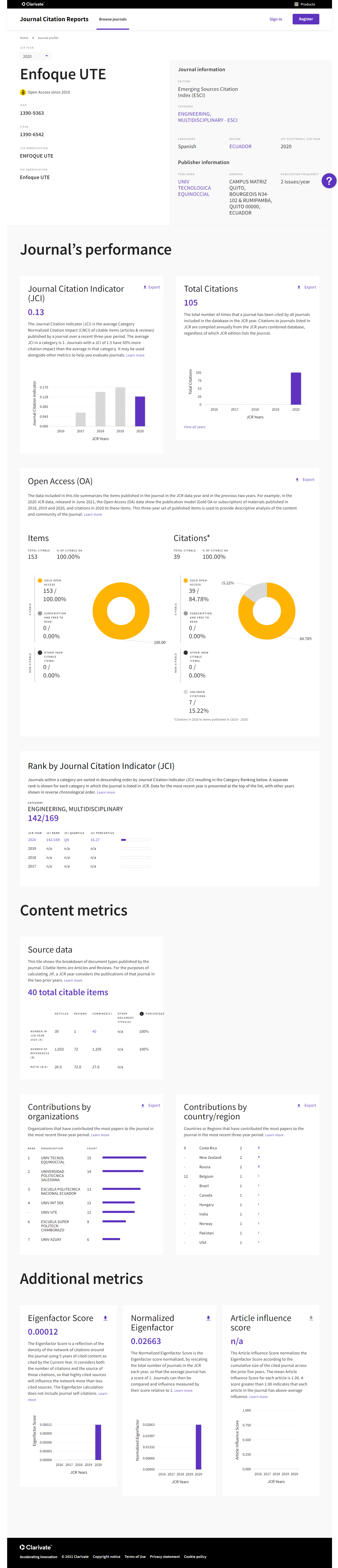